One of the reasons I fell in love with web design is that it incorporates so many different disciplines. The melting pot that is an effective website depends on the technology of devices, a well written and executed communications plan, compelling imagery, and a foundation of strong face-to-face relationships. And that only scratches the surface. One of the most captivating disciplines involved, and one that most small business owners don’t have time to delve into, is neuroscience.
We have talked about how websites are a two dimensional medium. But the challenge is even more complex than that. As John Medina put it in “Brain Rules”, “We do not see with our eyes. We see with our brains.” Understanding how a brain processes the information on a webpage is foundational to understanding how to build a webpage that captivates its user.
Here is the challenge: you have only 3 seconds to grab a user’s attention. If you have succeeded in grabbing them, users read only about 20% of the words on a page. And only about 20% of them get to the bottom of a page. Let’s look at the science behind why this is the case, and what strategies you can use to quickly get information to your user and entice them to take action.
There are entire disciplines devoted to the science of User Experiences on the web, not to mention libraries full of detailed, statistic filled books. I’m going to focus on two areas to that will quickly get you some actionable tips.
1. Structure your content to attract the eye

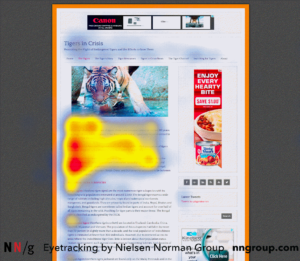
First of all, you might not realize it, but your eyes do not scan in straight lines. For sure, our eyes are trained to read from left to right based on the structure of Western languages. That means we all start at the upper left corner of a page. Then it gets interesting. Neuroscientists have tracked eye movements and noticed that most people’s scanning patterns fall into two general buckets: a “Z” or an “F”. They have created “heat maps” that repeatedly show that users will start at the top left corner, scan the top row, and then dive down to look for important information.
What does that mean for you?
If you have a text heavy page, a user might not be able to zero in quickly on what they are looking for. If they don’t think the page has the information they need, they bounce out of there. You need to create fixation points that will act as hooks that grab the brain’s attention.
What can you do?
- Create a page title that quickly summarizes the purpose of your page, and gives clues what information the user can expect to find.
- Recognize the fact that 70% of a user’s time is on the left side of the page, and left-justify your paragraphs and titles.
- Break up your text with headings, sub headings and bulleted lists.
- Bold key phrases that will help capture the eye and entice the user to back up and read the detail.
- Use graphics like photos and icons to give quick visual clues that will slow the eye down and entice the user to read more.
Speaking of visuals, let’s talk about our second point.
2. The brain prioritizes images over text
The second area I’d like to focus on is how important visual information is to the brain. What neuroscientists call Pictorial Superiority Effect means that the brain is hard wired to fixate on images in a way that is unique. For instance, if a presentation uses only text and verbal information, participants will remember about 10% of the information three days later. If you add pictures, the participants remember 65% of the information. (Thanks again, Brain Rules.)
This is a quick way to explain two characteristics of effective websites: 1) how pictures and graphics significantly boost click-through rates on a page; and 2) why consistent branding among marketing materials is so powerful.

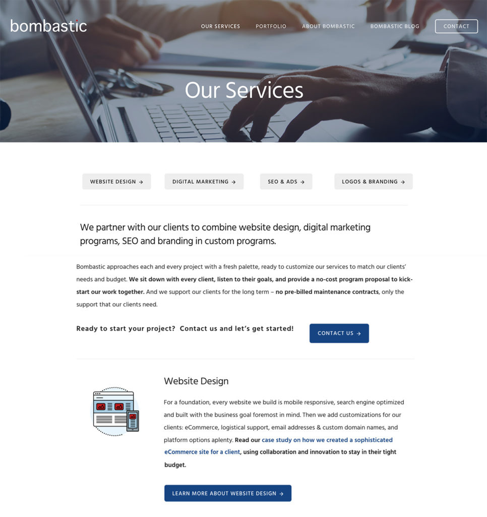
The Bombastic Services page uses photos, icons and colorful buttons.
What can you do?
- Use the science of color to shore up your branding strategy. A simple color scheme used consistently across marketing materials is key to giving consistency to the scanning eye looking for visual clues.
- Invest as much time on the imagery of a page as the text. That means finding impactful stock photography, using your own photos, and using some icons and simple graphics. Don’t ignore the technical limitations of downloading images, but balance your text with images that resonate.
- But not too much! Be careful of swinging this pendulum too far the other way. You don’t want to delete critical text that builds trust with your user and gives information to search engines. And having a visually busy website makes it difficult for the eye to scan for information.
- Always include photos or graphics in social media posts. It’s been proven that text-only social media posts are very easily ignored.
In general, neuroscience underscores why it is so necessary to take a step back from your website and look at it through your users’ eyes. Your business is your passion, and you will have a lot to say about it. But taking these simple tips into consideration will mean that more users will engage with your site.


